Me
nu
nu

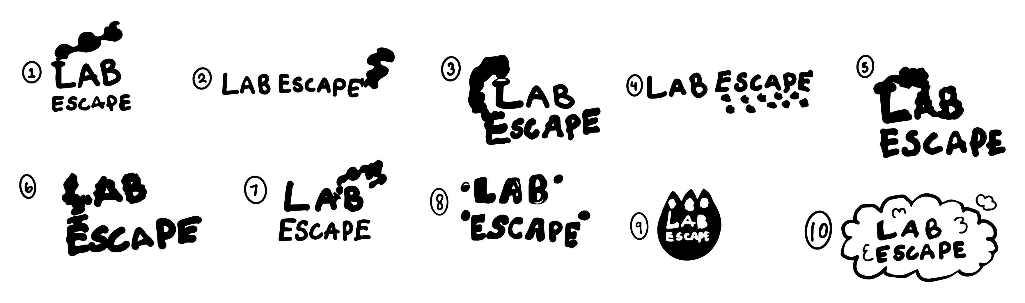
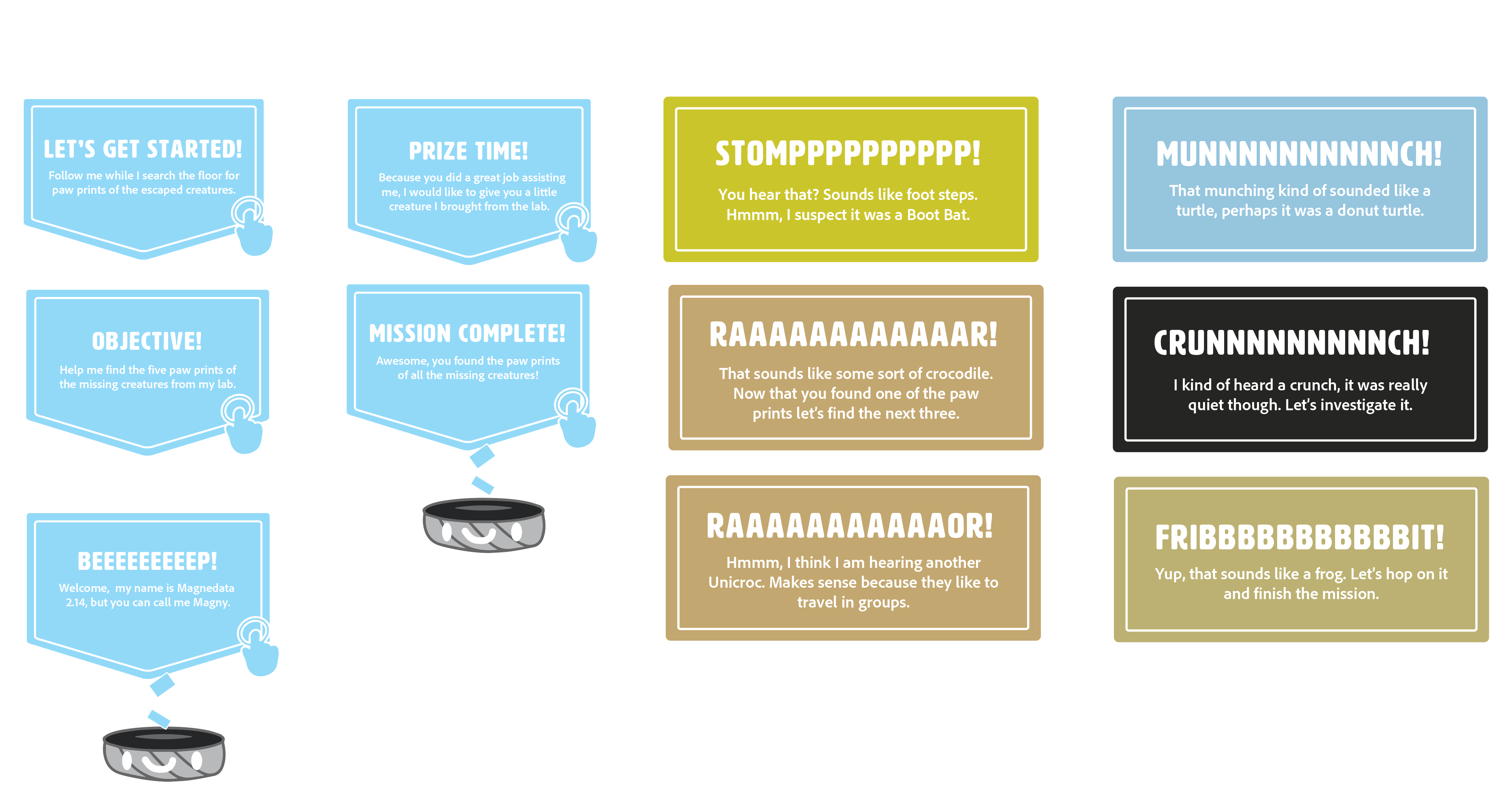
This project strives to promote the toy brand Lab Oddities' new series Lab Escape, which is an Augmented Reality Venture. The guide for the event is a robot called Magny. The event follows the narrative of Magny needing assistance finding the paw prints of missing lab creatures. I created all the illustrations and 3D elements in this project. I licensed the photos from Adobe Stock.
The event promotes a toy brand that demands a relatively young audience. The target audience is 8 to 12-year-olds. The secondary audience is 50 to 60-year-olds because that is a time when people are usually retired but still healthy enough to partake in physical activities.